

I tried Fontmaker - Font Keyboard App because the idea is immediately useful: turning my own handwriting into something I can type with instead of relying on another generic decorative font. It is a productivity app from Sociaaal LLC, aimed at people who want personal-looking text for messages, captions, notes, invitations, or creative posts. The basic app is free, rated for Everyone, and has attracted a 4.3 average from around 82 thousand ratings, with more than 5 million installs.
That popularity makes sense, but the app is more specific than a normal keyboard utility. It is not mainly about typing faster, correcting spelling, or replacing a full writing suite. Its appeal is the visual identity created by your own handwriting. In my experience, that makes it most interesting when ordinary system fonts feel too impersonal, while also creating a few practical compromises that are easy to overlook before installing it.
How Fontmaker turns handwriting into a usable keyboard
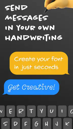
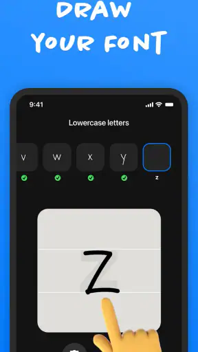
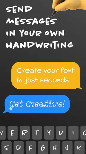
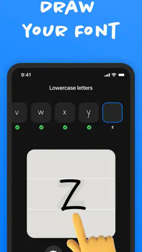
The central workflow is straightforward in concept. You provide handwritten characters, and the app turns that personal alphabet into a font you can use through a keyboard. The result is meant to make typed communication look as though it came from your own hand, without having to write every message manually.
That distinction matters. Fontmaker is not simply a collection of novelty typefaces. The point is to create a style that belongs to you. A carefully made alphabet can give short messages, social captions, digital cards, and informal notes a warmer appearance than the default keyboard. It can also be a fun way to make a recognizable visual signature without learning design software.
The first useful tip is to treat the setup as a small lettering project rather than a quick five-minute task. Handwriting changes depending on mood, speed, and the pen being used. If I rushed the characters, the finished font would look inconsistent. Taking time to keep letter height, spacing, and stroke weight reasonably similar should produce a more coherent result than simply filling in every character as quickly as possible.
I would also create the alphabet with the places I actually plan to type in mind. If most of my use is casual English messaging, clarity matters more than artistic flourishes. A dramatic capital letter may look attractive in a sample, yet become awkward when it appears repeatedly in names or sentences. For invitations or visual posts, I might accept more personality. For everyday conversations, readable lowercase letters are the better priority.
A personal font is not the same as handwritten input
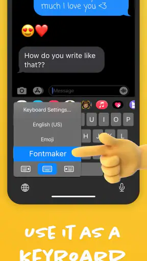
One detail worth understanding is that the app changes the appearance of typed characters; it does not turn the keyboard into handwriting recognition. I still select letters as I normally would, but the output carries the look of the font I created. That makes it more predictable than trying to write directly on a small phone screen, although it also means the result is only as expressive as the character set and style I prepared.
This makes Fontmaker especially appealing for people who want a repeatable signature. A handwritten note can vary from one attempt to the next, while a personal font gives the same visual treatment every time. The trade-off is that the digital version may look cleaner and more uniform than genuine handwriting. Anyone hoping for the irregularity of a real pen should expect to adjust their design choices rather than assume the app will reproduce every natural movement.
Another practical consideration is where the keyboard is useful. It fits best in text fields where a custom keyboard can be selected and where stylized characters are welcome. It is less suitable for formal documents, professional email, passwords, forms, or any situation where plain, highly compatible text is the safer choice. The visual effect is the reason to use it, not an improvement to every kind of typing.
What the free access gives you, and where purchases fit
Fontmaker is free to install, which makes experimenting with the concept relatively low-risk. The app also offers in-app purchases ranging from $0.99 to $14.99 per item. That means I can test whether a personal handwriting keyboard fits my routine before deciding whether any optional purchase is worthwhile.
The important value question is not simply whether the app costs nothing at the start. It is whether the free experience gives enough room to create and use a style that feels personal. For a curious user who only wants to try the idea, free access may be sufficient to decide quickly. Someone planning to use the result for repeated creative work should inspect the purchase prompts carefully and judge each optional item by the actual workflow it unlocks, rather than paying just because the app feels novel.
I would not treat the highest listed purchase amount as automatically good value. A custom font can be valuable when it supports a real project, such as a recurring social identity, a family event, or a set of personal digital stationery. It is harder to justify spending more if I only expect to send a few novelty messages. The app’s strongest financial advantage is the ability to try the basic idea first; its value becomes personal and use-case dependent after that.
There is also a difference between paying for convenience and paying for creative output. If the free workflow already lets me make a readable font and use it comfortably, an optional purchase may have limited impact on my day-to-day typing. If a purchase removes a frustrating step or provides something I repeatedly need, it could be worthwhile. I would make that decision after using the keyboard in real conversations, not from the preview alone.
Everyday situations where the app feels genuinely useful
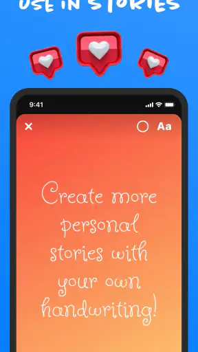
Imagine I am preparing a birthday message for a close friend. I could type the words in a standard font, add an image, and send it immediately. With a personal handwriting style, the same message can feel more like a small handmade card while still being created on a phone. That is a realistic advantage: the app saves the time of writing every line manually but keeps some of the visual warmth of handwriting.
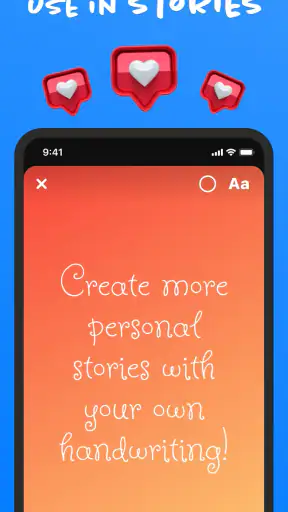
A similar workflow can work for social captions. I might use the custom keyboard for a short heading or a signature phrase, then switch back to the regular keyboard for longer text. This mixed approach is more practical than forcing an entire paragraph into a decorative style. It also keeps the important information easier to read while reserving the handwriting effect for emphasis.
For parents, students, and hobbyists, the app can be a low-pressure way to explore lettering. I can make one style that resembles my everyday writing, then improve it later after seeing which characters look awkward in actual sentences. That iterative process is one of the app’s less obvious strengths. The first font does not have to be the final one, and real use reveals problems that a sample alphabet will hide.
Small businesses and creators may also find a limited but useful role for it. A recognizable handwritten accent can help informal posts feel consistent. However, I would not make it the only visual identity for a brand without checking readability across devices and contexts. A personal font works best as an accent, signature, or campaign detail rather than a universal replacement for clear brand typography.
Where the experience can become frustrating
The biggest weakness is inherent in the concept: the quality of the result depends heavily on the handwriting supplied. If my writing is difficult to read, the generated font will not magically become clearer. Tiny differences in letter shape can also become more noticeable when repeated across a sentence. The app gives me a creative tool, but it does not remove the need for judgment about legibility.
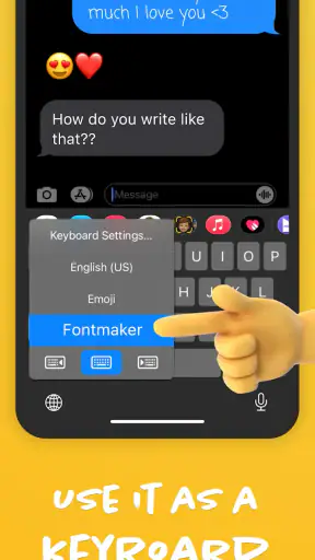
Keyboard switching is another potential source of friction. People who already move between several keyboards may find one more option inconvenient, especially when they only want the custom style occasionally. I would keep the standard keyboard available and use Fontmaker selectively instead of trying to make it my only input method. That preserves normal typing for searches, work messages, and forms while keeping the personal font ready for the moments where it adds something.
There is a compatibility trade-off as well. Stylized text may not look equally appealing in every app or on every recipient’s device. Even when the characters technically appear, the visual effect can be less consistent than it was in the creation screen. For anything important, I would send a test message to myself or a trusted contact before using the font for an invitation, announcement, or public post.
Speed is not the main reason to choose this app. A conventional keyboard with predictive text and familiar shortcuts will usually be better for long writing sessions. Fontmaker’s value comes from appearance and personal expression, so users expecting a faster typing experience may be disappointed. I would skip it if my priority is productivity in the traditional sense, such as drafting reports, handling large amounts of text, or improving typing accuracy.
It is also worth remembering that handwriting style can become tiring to look at when overused. A font that feels charming in a short greeting may become visually dense in a long explanation. My practical rule would be to use it for short passages, headings, signatures, and selected phrases, then return to a standard font whenever clarity matters more than personality.
How it compares with ordinary alternatives
The usual alternative is the keyboard already installed on the phone. That option wins for speed, familiarity, correction tools, and broad compatibility. It is the sensible choice for work, forms, and long messages. Fontmaker wins only when I want the text itself to carry a personal visual style.
Another alternative is writing with a stylus or finger and sending an image. That approach preserves more natural variation and can look genuinely handwritten, but it is slower to edit, harder to search, and less convenient inside ordinary conversations. Fontmaker sits between typed text and a handwritten image: I retain editable characters while gaining a personal appearance.
There are also standard font apps that offer large libraries of pre-made styles. Those can provide more variety immediately, but they do not necessarily feel like my own writing. Fontmaker is narrower and more personal. If I want dozens of polished display fonts, a font library may be a better fit. If I want one recognizable style based on my hand, this app has the more relevant idea.
For serious typography work, desktop font software remains more appropriate. Designers may need detailed spacing controls, multiple weights, export options, and professional file handling. Fontmaker is better understood as a phone-first creative utility for casual personalization, not a replacement for a complete type-design environment.
Who should use it and who should pass
I would recommend Fontmaker to someone who enjoys personalizing messages and does not mind spending time refining a handwriting sample. It is particularly appealing to people making digital cards, short social posts, personal signatures, or playful messages. The free starting point also makes it easy to explore without committing to a purchase immediately.
It can be a good choice for families or friends who want a shared visual touch for informal communication, although each person should create a style that remains readable. It may also suit a creator who wants a recurring handwritten accent without photographing or scanning handwritten notes every time.
I would be more cautious for users who need flawless professional output, extensive language support, or a keyboard optimized for speed. Anyone who dislikes switching keyboards, rarely uses decorative text, or expects automatic handwriting recognition should probably skip it. The app is not a universal productivity upgrade; it is a focused tool for making typed words look personal.
Before spending on an optional item, I would complete one real workflow from start to finish: create the style, activate the keyboard, type a message, switch back to the normal keyboard, and check how the result appears in the app where I intend to use it. That simple test answers more than a preview does. It shows whether the style is readable, whether keyboard switching bothers me, and whether I will actually use the feature after the first day.
My final assessment
Fontmaker - Font Keyboard App succeeds because it addresses a specific emotional gap in digital communication. Typed messages are convenient, but they can feel interchangeable. A font based on my handwriting gives short text a more personal surface without requiring me to write and photograph everything manually.
Its free entry point is a sensible way to test that idea, while the optional purchases mean I should evaluate paid value according to my actual use rather than assume every extra is necessary. The app’s 1.8.11.89 version is available for devices running Android 8.0 or later, and its Everyone rating makes it approachable for a broad audience.
My recommendation is positive, with clear boundaries. I would install it if I wanted a personal handwriting style for short messages, creative captions, or digital cards. I would keep a regular keyboard for serious writing and everyday forms, and I would test the custom font in the exact apps where I plan to use it. The best reason to choose Fontmaker is not faster typing; it is making ordinary typed words feel more like they came from me.


